
TikTok Slideshow Ideas for Finance and Budgeting Apps
12 first-slide lines for budgeting, subscription and bill-splitting apps, three slide-by-slide outlines, and money claims to keep off your slides.
By the SlideBase team · November 4, 2026 · 9 min read
Finance slideshows that bring installs on TikTok do the arithmetic the viewer has been avoiding: what a habit costs over a year, where a paycheck actually goes, how much a forgotten subscription has taken. They never promise returns, and the app shows up on the last slide as the thing that does this math automatically. This page gives you 12 first-slide lines for budgeting, saving, expense-splitting and subscription-tracking apps, three slide-by-slide outlines, and a short list of money claims to keep off your slides. SlideBase can draft decks like these from your store listing, but every idea below works with a notes app and a template too.
Money content runs on one feeling: “wait, how much?”
Most people under 35 have a vague, slightly guilty idea of where their money goes. They have never added it up, because adding it up is unpleasant. A slideshow that adds it up for them, one number per slide, produces a small shock on every swipe. That shock is what keeps people swiping to slide 6, and it is the same shock your app is built to deliver every week.
So the job of a finance deck is not to teach finance. It is to make one number feel personal. “The average household wastes money on subscriptions” is a headline nobody stops for. “You have paid for that gym you go to twice a month 14 times this year” is a sentence someone reads twice.
Three emotional angles do almost all the work in this category, and every hook below uses one of them:
- Leak: money leaving without you noticing (subscriptions, fees, small daily spends).
- Relief: the feeling of knowing exactly where you stand (a budget that balances, a bill that is covered).
- Fairness: money between people (splitting rent, the friend who never pays back, couples’ finances).
Borrow the “explained for normal people” format
One of the best-performing structures we have generated is not a finance deck at all. It is a nutrition explainer SlideBase made for a food app called BitePal. It takes a word people pretend to understand (“macros”), explains it in plain language, and compares two things that cost the same but behave differently. That structure maps almost one-to-one onto money.
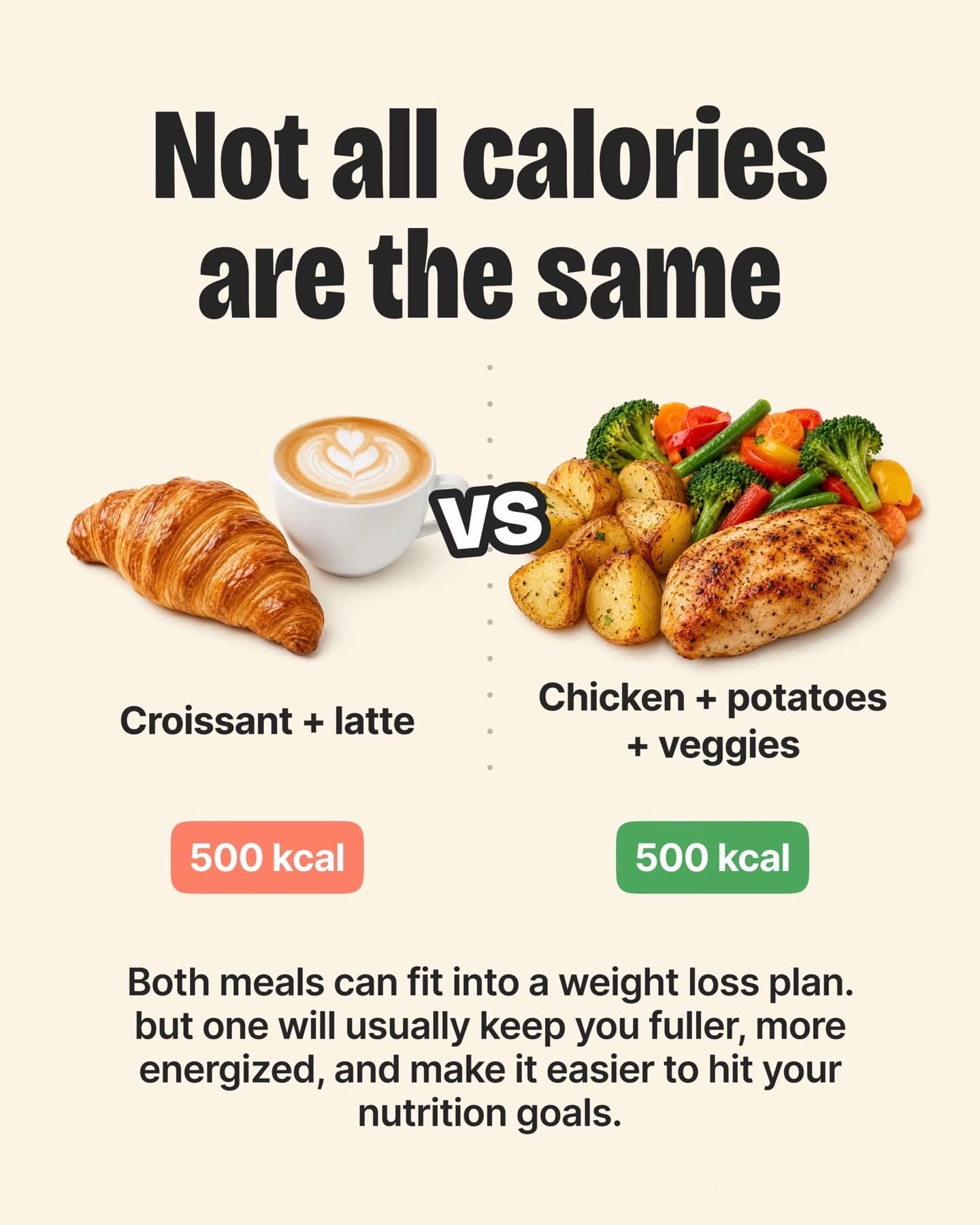
The finance version: “What the hell is an emergency fund? (explained for normal people)”, then one slide per idea, then “$200 a month vs $200 once: same money, very different year”. Use a mascot, an illustration or plain type; finance slides do not need stock photos of people holding cash, and those photos make a post look like an ad.
12 first-slide lines for finance and budgeting apps
Each line is paired with the angle it uses and the number you would need to back it up. If you cannot source the number, either use the viewer’s own numbers (“your”, with a worked example) or rephrase it as a question.
| # | First slide | Angle | What you need to back it |
|---|---|---|---|
| 1 | “I added up every subscription I forgot I had. It was $61 a month.” | Leak | Your own statement, screenshot with details blurred |
| 2 | “Your $4 lunch-time snack is a $1,040 a year decision” | Leak | Simple math: $4 × 5 days × 52 weeks |
| 3 | “Free trials are designed for you to forget day 7” | Leak | How auto-renew works; no statistic required |
| 4 | “The budget rule everyone quotes doesn’t work if you rent in a city” | Relief | The 50/30/20 split applied to a sample rent |
| 5 | “What I check on payday, in the first 10 minutes” | Relief | A routine; first-person, no claims |
| 6 | “How to know you can afford something before you buy it” | Relief | A worked example with round numbers |
| 7 | “Splitting rent 50/50 is unfair if one room is bigger. Here is the fix.” | Fairness | A square-metre split worked out on one slide |
| 8 | “The friend who ‘forgets’ to pay you back costs more than money” | Fairness | Nothing; it is a relatable story |
| 9 | “How couples who don’t fight about money split the bills” | Fairness | Three named methods (equal, proportional, pooled) |
| 10 | “Your bank app shows what you spent. Not what you have left to spend.” | Relief | Two screenshots: balance vs safe-to-spend |
| 11 | “5 money words your parents never explained” | Relief | Plain definitions (APR, overdraft, sinking fund…) |
| 12 | “Every month ends at day 24 for me. I finally found out why.” | Leak | A spending-by-week chart from your app |
Lines 1, 8 and 12 are confessions, which tend to collect the most comments, because people reply with their own number. Lines 2 and 7 are pure math, which collect the most saves. A healthy finance account alternates between the two. For more hook structures beyond money, see slideshow hook formulas for apps.
Three outlines, slide by slide
Outline A: the subscription audit (subscription tracker)
| Slide | Text | Visual |
|---|---|---|
| 1 | “I added up every subscription I forgot I had. It was $61 a month.” | Blurred bank statement, total circled |
| 2 | “The streaming one I watch once a month: $15.99” | Logo-free icon of a TV |
| 3 | “The app I tried for a week in March: $9.99, every month since” | Calendar with months crossed off |
| 4 | “The cloud storage I upgraded once and never needed: $2.99” | Storage bar 12% full |
| 5 | “$61 a month is $732 a year. That was a flight home.” | Big number, nothing else |
| 6 | “Renewly finds them all and reminds you 3 days before each one charges. Link in bio.” | App screenshot of the renewal list |
The trick on slide 5 is converting the yearly total into something concrete. “$732” is abstract; “a flight home” is a feeling. Change the object to fit your audience: a month of groceries, a concert, a weekend away.
Outline B: the fair split (expense-splitting app)
| Slide | Text | Visual |
|---|---|---|
| 1 | “Splitting rent 50/50 is unfair if one room is bigger. Here is the fix.” | Floor plan with two rooms of different sizes |
| 2 | “Rent: $2,000. Room A: 14 m². Room B: 9 m². Shared space: everything else.” | Same plan, labelled |
| 3 | “Split the shared part 50/50. Split the private part by size.” | Plan with two colours |
| 4 | “Result: about $1,110 and $890 instead of $1,000 each.” | Two big numbers side by side |
| 5 | “The bigger room still costs less than living alone. Nobody loses.” | Text only |
| 6 | “Halves does this math for every bill in the flat, automatically. Link in bio.” | App screen with the room-size split |
Show your working on slide 2 and 3 so people can check it. The numbers in slide 4 assume half the flat is shared space; say so in the caption, because someone will do the math in the comments, and a correct answer to a correction is free reach.
Outline C: the day-24 problem (budgeting app)
| Slide | Text | Visual |
|---|---|---|
| 1 | “Every month ends at day 24 for me. I finally found out why.” | Calendar, days 25–31 greyed out |
| 2 | “It wasn’t one big purchase. It was the first weekend after payday.” | Spending chart with a spike on days 1–3 |
| 3 | “Payday feels like having money. It is actually having this month’s money.” | Text only |
| 4 | “What changed it: moving the bills out on payday, before the weekend.” | Two bars: before / after |
| 5 | “Now I see one number: what is safe to spend until the next paycheck.” | Single large number on a phone |
| 6 | “That number is the whole home screen of Payday. Link in bio.” | App screenshot |
What a finance app should never put on a slide
Money is a regulated topic in most countries, and TikTok’s community guidelines and branded-content rules are stricter about financial content than about, say, recipes. Even organic posts from an app account read as marketing. Keep these off your slides and captions:
- Return promises. “Grow your savings 20% this year” or anything that sounds like an investment outcome. If your app has any investing feature, check what your local regulator allows in promotions before mentioning it at all.
- Get-rich framing. “Passive income”, “quit your job”, “make $X a month”. These attract the wrong audience and sit next to scam content in the feed.
- Specific financial advice. “You should put your money in X.” Explain concepts and show your own routine; do not tell individuals what to do with their money.
- Unsourced statistics about debt or savings. If you quote a national figure, name the source on the slide. Otherwise use worked examples with round numbers.
- Real account details. Blur account numbers, names and anything identifying in statement screenshots, including your own.
SlideBase lets you keep a list of words and claims the app must never use in its brand profile, which is useful in this category specifically: you write “guaranteed”, “returns” and “passive income” once and they stay out of every draft. Whatever tool you use, have one person read every finance post before it goes live.
Choosing the right app screen for slide 6
Finance apps tend to have busy dashboards. A dashboard with eight cards looks like work, which is exactly the feeling the viewer is trying to avoid. Pick the screen with one number on it:
- Subscription tracker → the upcoming-renewals list with dates.
- Budgeting app → the safe-to-spend number or a single category bar.
- Splitting app → the “you owe / you are owed” summary.
- Savings app → a goal progress bar at, say, 64%, not 100%. Unfinished goals feel achievable.
Use made-up but realistic demo data, never a real user’s screen. And keep the same screen as the first screenshot on the store page you link to, so the viewer recognises it after the tap.
How often, and what to watch
Finance audiences are less impulsive than fitness or AI-app audiences. A viewer might save your subscription audit post on Tuesday and install on payday. That makes saves the metric to watch, more than views or likes. A post with 3,000 views and 120 saves is a better signal than one with 20,000 views and 15 saves.
Post daily, rotate the three angles (leak, relief, fairness), and time at least one post a week close to the most common payday in your market, when people think about money anyway. After 30 posts, compare saves per 1,000 views by angle and lean into the winner. The broader cadence logic is in our TikTok slideshow strategy for apps, and the free channels that sit alongside TikTok are covered in how to get app downloads without ads.
If you want the first drafts written for you, SlideBase reads your App Store or Google Play listing, proposes hooks in these three angles, lays out the slides in your brand colours and can schedule them to TikTok and Instagram. Credits are spent per slide, so a 6-slide deck uses about 6; the plans page lists what each tier includes, and faceless app marketing explains why this format suits founders who would rather not be on camera. Start here if you want to try it on your own app.
Other categories have their own idea pages: fitness apps, language-learning apps and AI apps.
FAQ
Can a budgeting app use real numbers on TikTok slides?
Yes, if they are your own and you blur anything identifying. Worked examples with round numbers ($4 a day, $2,000 rent) are often better, because viewers can check the math and plug in their own figures. Never use a real customer’s data, even anonymised, without consent.
Is it risky to post about money on TikTok as an app?
Explaining concepts and sharing routines is fine. The risk starts with promises of returns, investment recommendations and get-rich language, which can break platform rules and financial-promotion laws. Keep every post about understanding money, not about making more of it.
What finance hook gets the most comments?
First-person confessions with a specific number, like “I added up every subscription I forgot I had”. Viewers reply with their own total. Fairness topics (splitting rent, friends who do not pay back) are close behind, because everyone has an opinion.
Should finance slideshows use stock photos of money?
Usually not. Cash, credit cards and people smiling at laptops read as ads and lower trust. Plain type, simple charts, an illustration or a mascot, and one real app screenshot at the end work better.